Switch
A toggle represents a physical switch that allows someone to choose between two mutually exclusive options.
For example, "On/Off", "Show/Hide". Choosing an option should produce an immediate result.
Examples
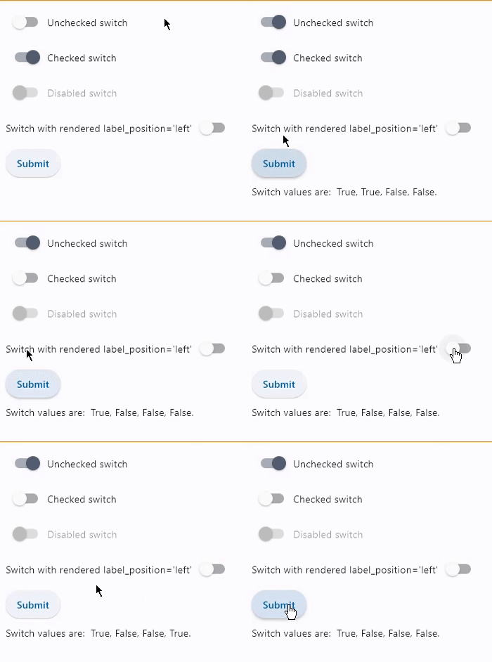
Basic switches
loading...
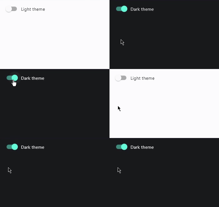
Switch with on_change event
loading...
Properties
active_color
The color to use when this switch is on.
active_track_color
The color to use on the track when this switch is on.
If track_color returns a non-null color in the SELECTED state, it will be used instead of this color.
adaptive
If the value is True, an adaptive Switch is created based on whether the target platform is iOS/macOS.
On iOS and macOS, a CupertinoSwitch is created, which has matching functionality and presentation as Switch, and the graphics as expected on iOS. On other platforms, a Material Switch is created.
Defaults to False. See the example of
usage here.
autofocus
True if the control will be selected as the initial focus. If there is more than one control on a page with autofocus set, then the first one added to the page will get focus.
focus_color
The color to use for the focus highlight for keyboard interactions.
hover_color
The color to be used when it is being hovered over by the mouse pointer.
inactive_thumb_color
The color to use on the thumb when this switch is off.
Defaults to colors defined in the material design specification.
If thumb_color returns a non-null color in the DEFAULT state, it will be used instead of this color.
inactive_thumb_image
An image to use on the thumb of this switch when the switch is off. Can be a local file path or URL.
inactive_track_color
The color to use on the track when this switch is off.
Defaults to colors defined in the material design specification.
If track_color returns a non-null color in the DEFAULT state, it will be used instead of this color.
label
The clickable label to display on the right of the Switch.
label_style
The label's style.
Value is of type TextStyle.
label_position
Value is of type LabelPosition and defaults to LabelPosition.RIGHT.
mouse_cursor
The cursor to be displayed when a mouse pointer enters or is hovering over this control.
The value is MouseCursor enum.
overlay_color
The color for the switch's Material in
various ControlState states.
The following ControlState values are
supported: PRESSED, SELECTED, HOVERED, FOCUSED and DEFAULT.
splash_radius
The radius of the splash effect when the switch is pressed.
thumb_color
The color of this switch's thumb in
various ControlState states.
The following ControlState values are
supported: SELECTED, HOVERED, DISABLED, FOCUSED and DEFAULT (fallback).
thumb_icon
The icon of this Switch's thumb in various ControlState states.
The following ControlState values are
supported: SELECTED, HOVERED, DISABLED, FOCUSED and DEFAULT (fallback).
track_color
The color of this switch's track in
various ControlState states.
The following ControlState values are
supported: SELECTED, HOVERED, DISABLED, FOCUSED and DEFAULT (fallback).
track_outline_color
The outline color of this switch's track in
various ControlState states.
The following ControlState values are
supported: SELECTED, HOVERED, DISABLED, FOCUSED and DEFAULT (fallback).
track_outline_width
The outline width of this switch's track in all or specific ControlState states.
The following states are supported: SELECTED, HOVERED, DISABLED, FOCUSED and DEFAULT (fallback).
value
Current value of the Switch.
Events
on_blur
Fires when the control has lost focus.
on_change
Fires when the state of the Switch is changed.
on_focus
Fires when the control has received focus.
Event handler argument is of type OnFocusEvent.