Slider
A slider provides a visual indication of adjustable content, as well as the current setting in the total range of content.
Use a slider when you want people to set defined values (such as volume or brightness), or when people would benefit from instant feedback on the effect of setting changes.
Examples
Basic sliders
loading...
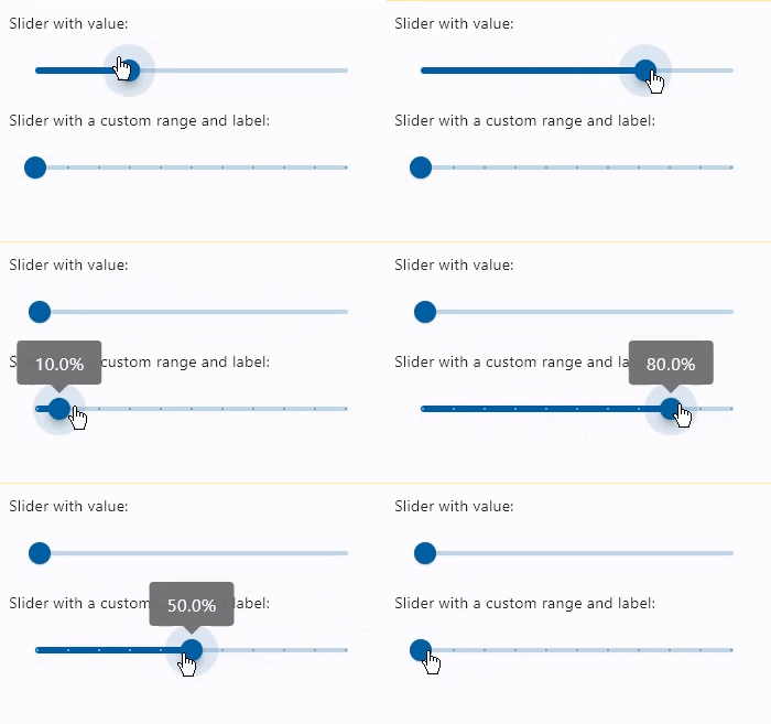
Sliders with values
loading...
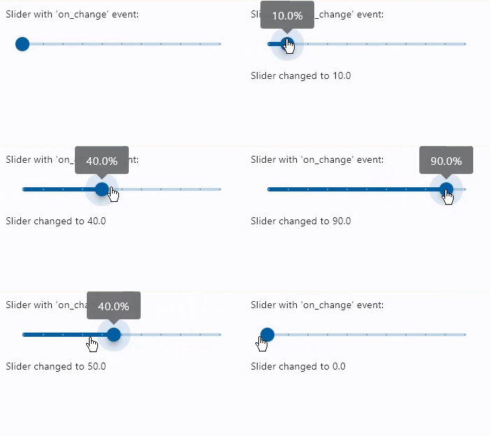
Slider with on_change event
loading...
Properties
active_color
The color to use for the portion of the slider track that is active.
The "active" side of the slider is the side between the thumb and the minimum value.
adaptive
If the value is True, an adaptive Slider is created based on whether the target platform is iOS or macOS.
On iOS and macOS, a CupertinoSlider, which has matching functionality and presentation as Slider, and are the graphics expected on iOS. On other platforms, this creates a Material Slider.
Defaults to False.
autofocus
True if the control will be selected as the initial focus. If there is more than one control on a page with autofocus set, then the first one added to the page will get focus.
divisions
The number of discrete divisions.
Typically used with label to show the current discrete value.
If not set, the slider is continuous.
inactive_color
The color for the inactive portion of the slider track.
The "inactive" side of the slider is the side between the thumb and the maximum value.
interaction
The allowed way for the user to interact with this slider. Value is
a SliderInteraction and defaults to SliderInteraction.TAP_AND_SLIDE.
label
Format with {value}.
A label to show above the slider when the slider is active. The value of label may contain {value} which will be replaced with a current slider value.
It is used to display the value of a discrete slider, and it is displayed as part of the value indicator shape.
If not set, then the value indicator will not be displayed.
max
The maximum value the user can select. Must be greater than or equal to min.
If the max is equal to the min, then the slider is disabled.
Defaults to 1.0.
min
The minimum value the user can select. Must be less than or equal to max.
If the max is equal to the min, then the slider is disabled.
Defaults to 0.0.
mouse_cursor
The cursor to be displayed when a mouse pointer enters or is hovering over this control.
Value is of type MouseCursor.
overlay_color
The highlight color that's typically used to indicate that the range slider thumb is
in ControlState.HOVERED or DRAGGED ControlStates.
round
The number of decimals displayed on the label containing value.
Defaults to 0, which displays value rounded to the nearest integer.
secondary_active_color
The color to use for the portion of the slider track between the thumb and the secondary_track_value.
secondary_track_value
The secondary track value for this slider.
If not null, a secondary track using secondary_active_color is drawn between the thumb and this value, over the inactive track. If less than value, then the secondary track is not shown.
It can be ideal for media scenarios such as showing the buffering progress while the value shows the play progress.
thumb_color
The color of the thumb.
value
The currently selected value for this slider.
The slider's thumb is drawn at a position that corresponds to this value.
Defaults to value of min property.
Events
on_blur
Fires when the control has lost focus.
on_change
Fires when the state of the Slider is changed.
on_change_end
Fires when the user is done selecting a new value for the slider.
on_change_start
Fires when the user starts selecting a new value for the slider.
on_focus
Fires when the control has received focus.