Checkbox
Checkbox allows to select one or more items from a group, or switch between two mutually exclusive options (checked or unchecked, on or off).
Examples
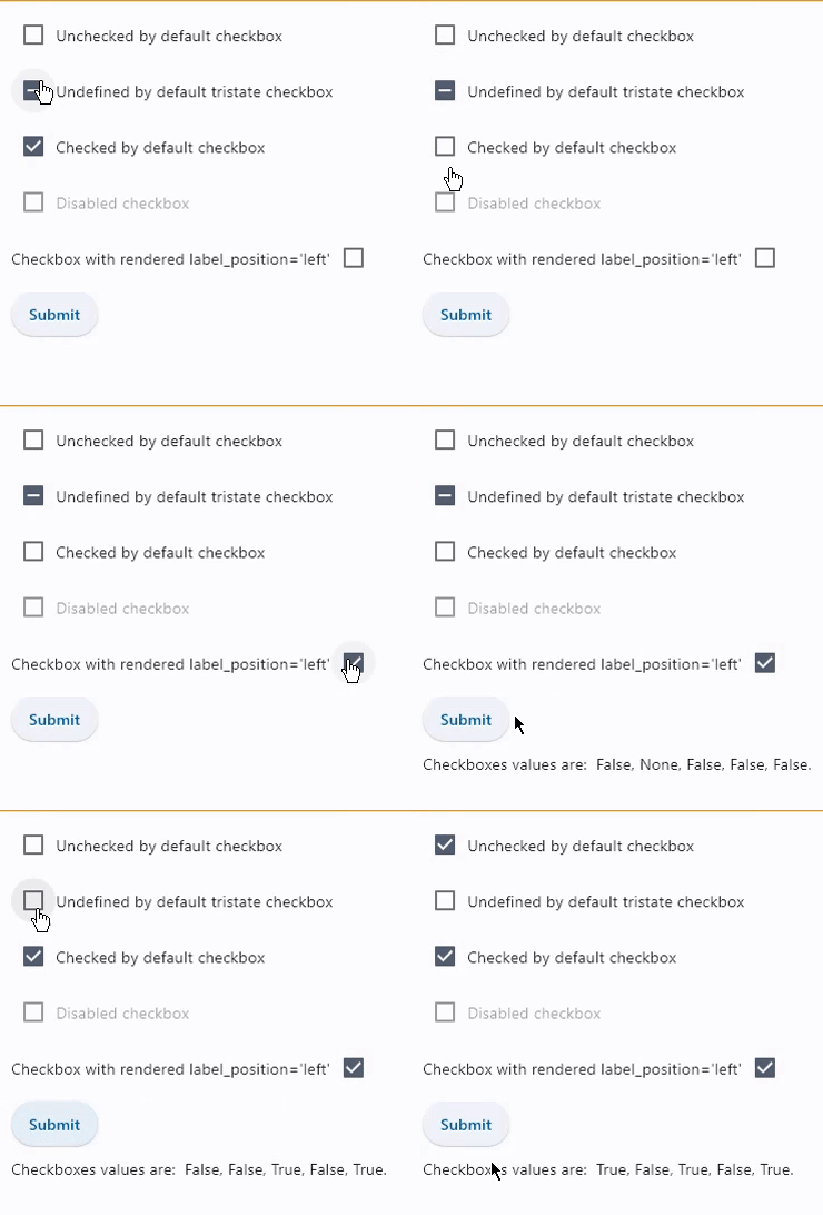
Basic checkboxes
loading...
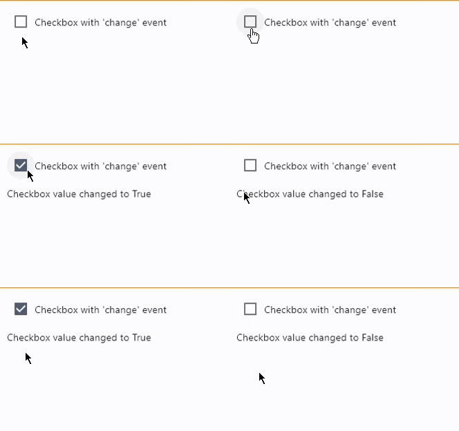
Checkbox with on_change event
loading...
Properties
active_color
The color to use when this checkbox is checked.
adaptive
If the value is True, an adaptive Checkbox is created based on whether the target platform is iOS/macOS.
On iOS and macOS, a CupertinoCheckbox is created, which has matching functionality and presentation as Checkbox, and the graphics as expected on iOS. On other platforms, a Material Checkbox is created.
See the example of usage here.
Defaults to False.
autofocus
True if the control will be selected as the initial focus. If there is more than one control on a page with autofocus set, then the first one added to the page will get focus.
border
The color and width of the checkbox's border to be rendered when the checkbox's value is False.
check_color
The color to use for the check icon when this checkbox is checked.
fill_color
The color that fills the checkbox in
various ControlState states.
hover_color
The color to use when this checkbox is hovered.
is_error
Whether this checkbox wants to show an error state. When True this checkbox will have a different default container color and check color. Defaults to False.
label
The clickable label to display on the right of a checkbox.
label_style
The label's style. An instance of type TextStyle.
label_position
Defines on which side of the checkbox the label should be shown.
Value is of type LabelPosition and defaults to LabelPosition.RIGHT.
mouse_cursor
The cursor to be displayed when a mouse pointer enters or is hovering over this control.
Value is of type MouseCursor.
overlay_color
The color of the checkbox's overlay in
various ControlState states.
This property supports the following ControlState values: PRESSED, SELECTED, HOVERED and FOCUSED.
semantics_label
The semantic label for the checkbox that is not shown in the UI, but will be announced by screen readers in accessibility modes (e.g TalkBack/VoiceOver).
shape
The shape of the checkbox. The value is an instance of OutlinedBorder class.
Defaults to RoundedRectangleBorder(radius=2).
splash_radius
The radius of the circular Material ink response (ripple) in logical pixels.
Defaults to 20.0.
tristate
If True the checkboxes value can be True, False, or None.
Checkbox displays a dash when its value is None.
value
Current value of the checkbox.
Events
on_blur
Fires when the control has lost focus.
on_change
Fires when the state of the Checkbox is changed.
on_focus
Fires when the control has received focus.