DropdownM2
A material design button for selecting from a list of items.
A dropdown lets the user select from a number of items. The dropdown shows the currently selected item as well as an arrow that opens a menu for selecting another item.
Since version 0.27.0, Flet uses DropdownMenu flutter widget for Dropdown control, which is a Material 3 version of previously used DropdownButton.
Some properties of previous Dropdown implementation are not available in the new version and were "stubbed" - they will not break your program but don't do anything. See the list of deprecated properties here.
Previous version of Dropdown control is available as DropdownM2 control and will be removed in Flet 0.30.0.
Examples
Basic dropdown
loading...
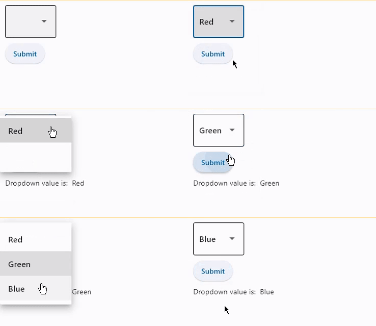
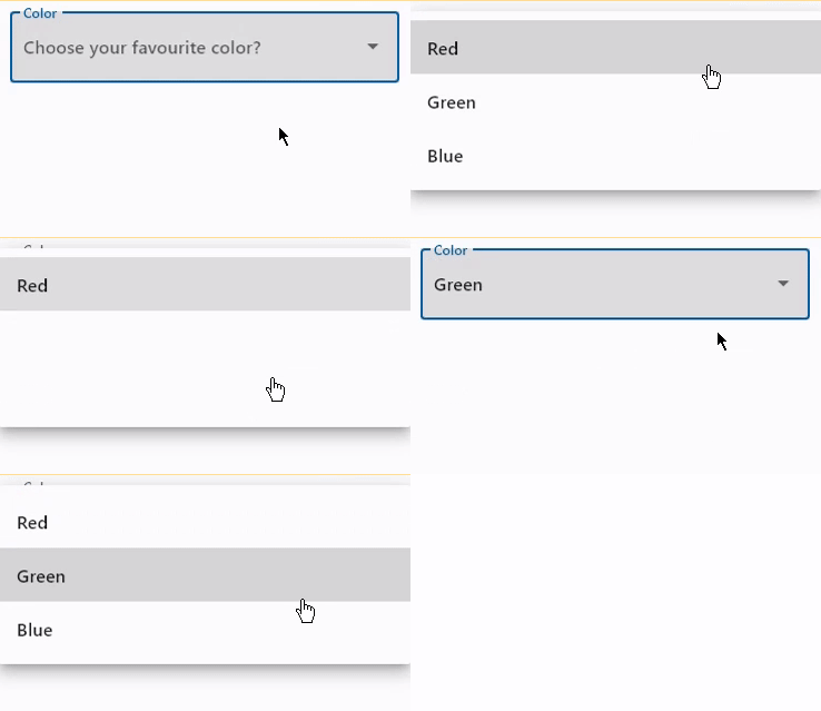
Dropdown with label and hint
loading...
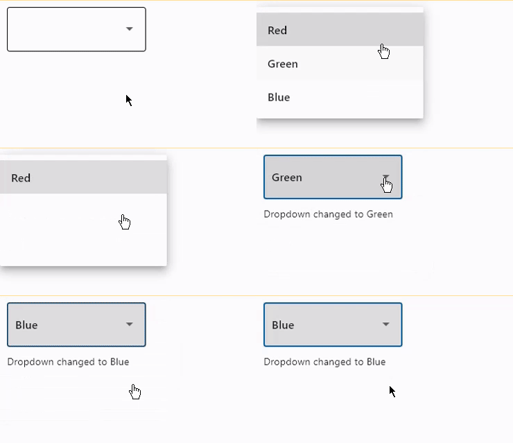
Dropdown with on_change event
loading...
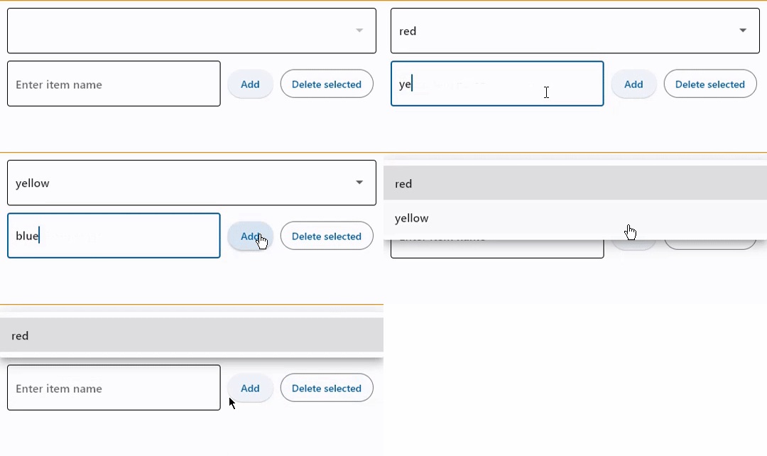
Change items in dropdown options
loading...
DropdownM2 properties
alignment
Defines how the hint or the selected item is positioned within this dropdown.
Alignment is an instance of Alignment class.
autofocus
True if the control will be selected as the initial focus. If there is more than one control on a page with autofocus set, then the first one added to the page will get focus.
bgcolor
The background color of both the dropdown button and it's menu.
To set a different background color for the dropdown button, use fill_color or focused_bgcolor properties.
border
Border around input.
Value is of type InputBorder and defaults to InputBorder.OUTLINE.
border_color
Border color. Could be transparent to hide the border.
border_radius
Border radius is an instance of BorderRadius class.
border_width
The width of the border in virtual pixels. Set to 0 to completely remove border.
Defaults to 1.
color
Text color.
content_padding
The padding for the input decoration's container.
counter
A Control to place below the line as a character count.
If None or an empty string and counter_text isn't specified, then nothing will appear in the counter's location.
counter_style
The TextStyle to use for counter_text.
counter_text
Optional text to place below the line as a character count.
If None or an empty string and counter isn't specified, then nothing will appear in the counter's location. If counter is specified and visible, then this counter_text will be ignored.
dense
Whether the TextField is part of a dense form (ie, uses less vertical space).
disabled_hint_content
A placeholder Control for the dropdown's value that is displayed when value is None and the dropdown is disabled.
elevation
The dropdown's elevation.
Defaults to 8.
enable_feedback
Whether detected gestures should provide acoustic and/or haptic feedback. On Android, for example, setting this
to True produce a click sound and a long-press will produce a short vibration.
Defaults to True.
error_style
The TextStyle to use for error_text.
error_text
Text that appears below the input border.
If non-null, the border's color animates to red and the helper_text is not shown.
filled
If True the decoration's container is filled with theme fill_color.
If filled=None(default), then it is implicitly set to True when at least one of the following is
not None: fill_color, focused_bgcolor and bgcolor.
fill_color
Background color of the dropdown button. Will not be visible if filled=False.
focused_bgcolor
Background color of dropdown in focused state. Will not be visible if filled=False.
focused_border_color
Border color in focused state.
focused_border_width
Border width in focused state.
focused_color
Text color when Dropdown is focused.
helper_style
The TextStyle to use for helper_text.
helper_text
Text that provides context about the input's value, such as how the value will be used.
If non-null, the text is displayed below the input decorator, in the same location as error_text. If a non-null error_text value is specified then the helper text is not shown.
hint_content
A placeholder Control for the dropdown's value that is displayed when value is None.
hint_style
The TextStyle to use for hint_text.
hint_text
Text that suggests what sort of input the field accepts.
Displayed on top of the input when it's empty and either (a) label is null or (b) the input has the focus.
icon
The name of the icon or Control to show before the input field and outside of the decoration's container.
Example with icon name:
icon=ft.Icons.BOOKMARK
Example with Control:
icon=ft.Icon(ft.Icons.BOOKMARK)
icon_content
icon_contentThe control to use for the drop-down button's icon. Defaults to an Icon(icons.ARROW_DROP_DOWN).
Deprecated in v0.25.0 and will be removed in v0.28.0. Use icon
instead.
icon_enabled_color
icon_enabled_colorThe color of any Icon descendant of icon_content if this button is enabled.
Deprecated in v0.25.0 and will be removed in v0.28.0. Use select_icon_enabled_color
instead.
icon_disabled_color
icon_disabled_colorThe color of any Icon descendant of icon_content if this button is disabled.
Deprecated in v0.25.0 and will be removed in v0.28.0. Use select_icon_enabled_color
instead.
icon_size
icon_sizeThe size of the icon button which wraps icon_content.
Defaults to 24.0.
Deprecated in v0.25.0 and will be removed in v0.28.0. Use icon
instead.
item_height
The height of the items/options in the dropdown menu.
label
Optional text that describes the input field.
When the input field is empty and unfocused, the label is displayed on top of the input field (i.e., at the same location on the screen where text may be entered in the input field). When the input field receives focus (or if the field is non-empty) the label moves above, either vertically adjacent to, or to the center of the input field.
label_style
The TextStyle to use for label.
max_menu_height
The maximum height of the dropdown menu.
options
A list of Option controls representing items in this dropdown.
options_fill_horizontally
Whether the dropdown's inner contents to horizontally fill its parent. By default this button's inner width is the minimum size of its content.
If True, the inner width is expanded to fill its surrounding container.
Value is of type bool and defaults to False.
padding
The padding around the visible portion of this dropdown.
prefix
Optional Control to place on the line before the input.
This can be used, for example, to add some padding to text that would otherwise be specified using prefix_text, or to add a custom control in front of the input. The control's baseline is lined up with the input baseline.
Only one of prefix and prefix_text can be specified.
The prefix appears after the prefix_icon, if both are specified.
prefix_icon
An icon that appears before the prefix or prefix_text and before the editable part of the text field, within the decoration's container.
prefix_style
The TextStyle to use for prefix_text.
prefix_text
Optional text prefix to place on the line before the input.
select_icon
The name of the icon or Control to use for the drop-down select button's icon. Defaults to an Icon(ft.Icons.ARROW_DROP_DOWN).
Example with icon name:
icon=ft.Icons.BOOKMARK
Example with Control:
icon=ft.Icon(ft.Icons.BOOKMARK)
select_icon_enabled_color
The color of any Icon descendant of select_icon if this button is enabled.
select_icon_disabled_color
The color of any Icon descendant of select_icon if this button is disabled.
select_icon_size
The size of the icon button which wraps select_icon.
Defaults to 24.0.
suffix
Optional Control to place on the line after the input.
This can be used, for example, to add some padding to the text that would otherwise be specified using suffix_text, or to add a custom control after the input. The control's baseline is lined up with the input baseline.
Only one of suffix and suffix_text can be specified.
The suffix appears before the suffix_icon, if both are specified.
suffix_icon
An icon that appears after the editable part of the text field and after the suffix or suffix_text, within the decoration's container.
suffix_style
The TextStyle to use for suffix_text.
suffix_text
Optional text suffix to place on the line after the input.
text_size
Text size in virtual pixels.
text_style
The TextStyle to use for text in this dropdown button and the dropdown menu that
appears when you tap the button.
value
key value of the selected option.
DropdownM2 methods
focus()
Moves focus to this dropdown.
DropdownM2 events
on_blur
Fires when the control has lost focus.
on_change
Fires when the selected item of this dropdown has changed.
on_click
Fires when this dropdown is clicked.
on_focus
Fires when the control has received focus.
Option properties
Represents an item in a dropdown. Either key or text must be specified, else an AssertionError will be raised.
alignment
Defines the alignment of this option in it's container.
Value is of type Alignment and defaults to alignment.center_left.
content
A Control to display in this option. If not specified, text will be used as fallback, else textwill be ignored.
key
Option's key. If not specified text will be used as fallback.
text
Option's display text. If not specified key will be used as fallback.
text_style
Defines the style of the text.
Value is of type TextStyle.
Option Events
on_click
Fires when this option is clicked.