SnackBar
A lightweight message with an optional action which briefly displays at the bottom of the screen.
Examples
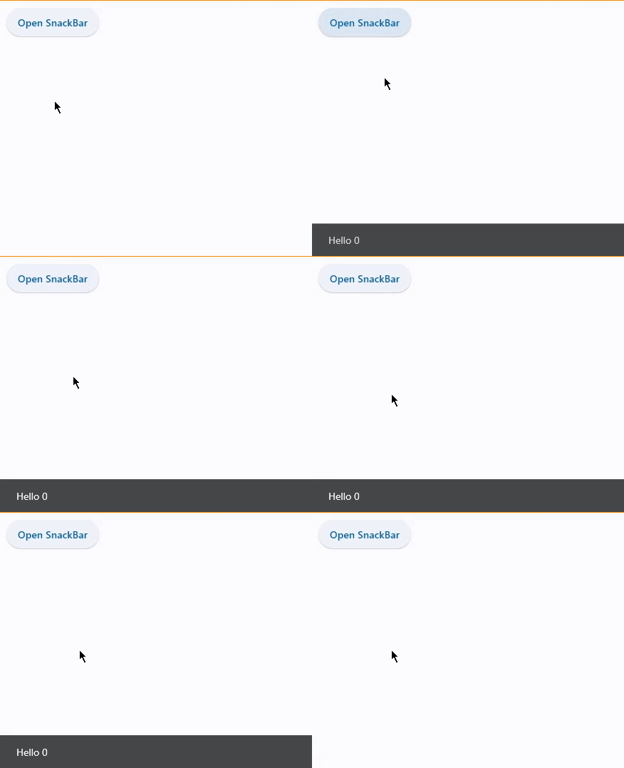
SnackBar with dynamic message
loading...
Properties
action
An optional action that the user can take based on the snack bar.
For example, the snack bar might let the user undo the operation that prompted the snackbar. Snack bars can have at most one action.
The action should not be "dismiss" or "cancel".
action_color
The foreground color of action button.
action_overflow_threshold
The percentage (between 0.0 and 1.0) threshold for action's width before it overflows to a new line.
If the width of the snackbar's content is greater than this percentage of the width of the snackbar minus the width of
its action, then the action will appear below the content.
At a value of 0.0, the action will not overflow to a new line.
Defaults to 0.25.
behavior
This defines the behavior and location of the snack bar.
Defines where a SnackBar should appear within a page and how its location should be adjusted when the page also includes a FloatingActionButton or a NavigationBar.
Value is of type SnackBarBehavior and defaults to SnackBarBehavior.FIXED.
Note:
- If
behavior=SnackBarBehavior.FLOATING, the length of the bar is defined by eitherwidthormargin, and if both are specified,widthtakes precedence overmargin. widthandmarginare ignored ifbehavior!=SnackBarBehavior.FLOATING.
bgcolor
SnackBar background color.
clip_behavior
The content will be clipped (or not) according to this option.
Value is of type ClipBehavior and defaults to ClipBehavior.HARD_EDGE.
close_icon_color
An optional color for the close icon, if show_close_icon=True.
content
The primary content of the snack bar.
Typically a Text control.
dismiss_direction
The direction in which the SnackBar can be dismissed.
Value is of type DismissDirection and defaults to DismissDirection.DOWN.
duration
The number of milliseconds that the SnackBar stays open for.
Defaults to 4000 (4 seconds).
elevation
The z-coordinate at which to place the snack bar. This controls the size of the shadow below the snack bar.
margin
Empty space to surround the snack bar.
Has effect only when behavior=SnackBarBehavior.FLOATING and will be ignored if width is specified.
open
Set to True to display a SnackBar. This property is automatically set to False once SnackBar is shown.
padding
The amount of padding to apply to the snack bar's content and optional action.
Value is of type Padding or a number.
shape
The shape of the snack bar's.
Value is of type OutlinedBorder.
show_close_icon
Whether to include a "close" icon widget.
Tapping the icon will close the snack bar.
width
The width of the snack bar.
If width is specified, the snack bar will be centered horizontally in the available space.
Has effect only when behavior=SnackBarBehavior.FLOATING. It can not be used if margin is specified.
Events
on_action
Fires when action button is clicked.
on_visible
Fires the first time that the snackbar is visible within the page.