AlertDialog
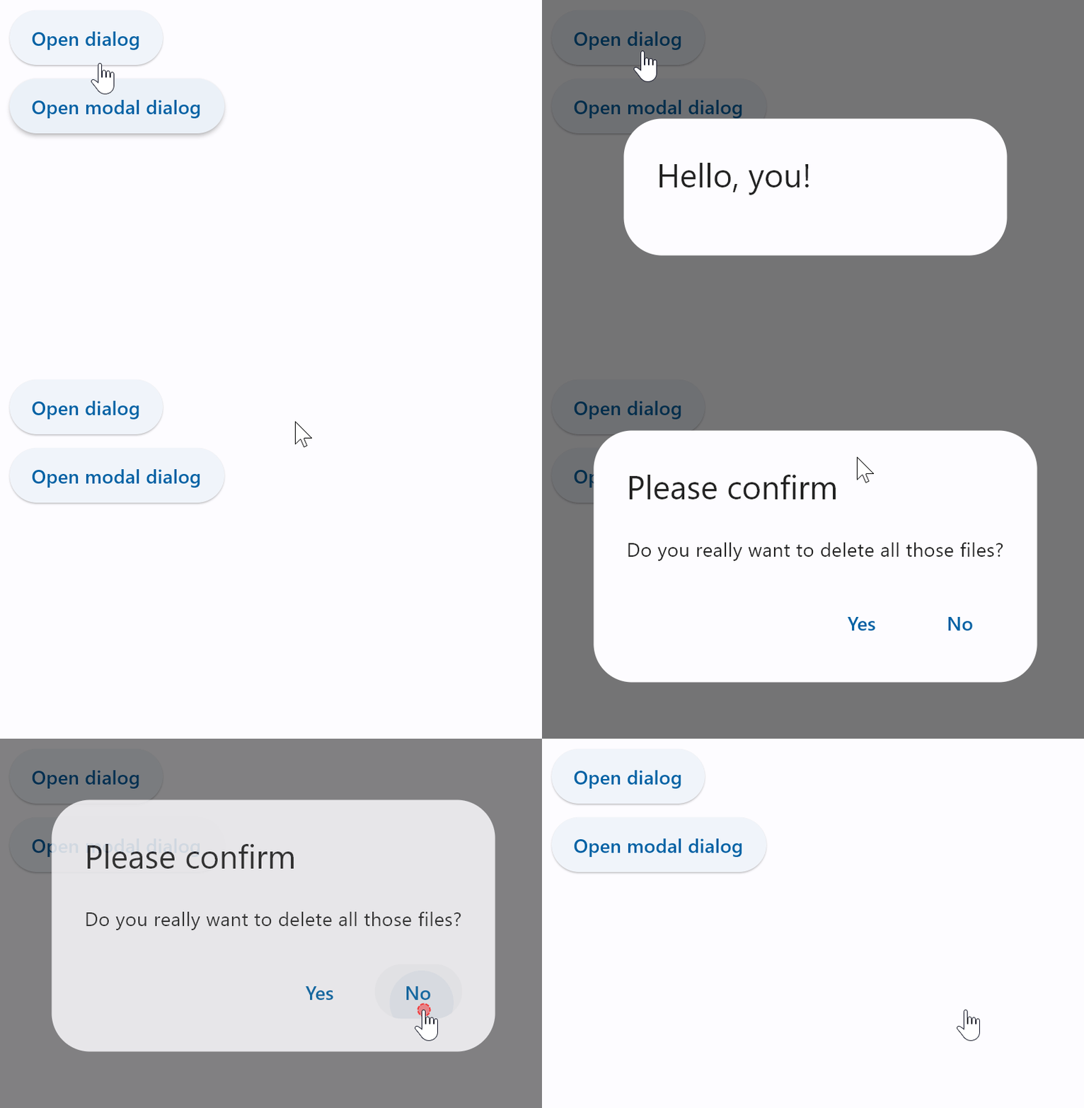
A material design alert dialog.
An alert dialog informs the user about situations that require acknowledgement. An alert dialog has an optional title and an optional list of actions. The title is displayed above the content and the actions are displayed below the content.
To open this control, simply call the page.open() helper-method.
Examples
Basic and modal dialogs
loading...
Properties
actions
The (optional) set of actions that are displayed at the bottom of the dialog.
Typically this is a list of TextButton controls.
action_button_padding
The padding that surrounds each button in actions.
Value is of type PaddingValue.
actions_alignment
Defines the horizontal layout of the actions.
Value is of type MainAxisAlignment and defaults to MainAxisAlignment.END.
actions_padding
Padding around the set of actions at the bottom of the dialog.
Typically used to provide padding to the button bar between the button bar and the edges of the dialog.
If are no actions, then no padding will be included. The padding around the button bar defaults to zero.
Value is of type PaddingValue.
adaptive
If the value is True, an adaptive AlertDialog is created based on whether the target platform is iOS/macOS.
On iOS and macOS, a CupertinoAlertDialog is created, which has matching functionality and presentation as AlertDialog, and the graphics as expected on iOS. On other platforms, a Material AlertDialog is created.
See the example of usage here.
Value is of type bool and defaults to False.
barrier_color
The color of the modal barrier that darkens everything below the dialog.
If None, the DialogTheme.barrier_color is used.
If it is also None, then Colors.BLACK_54 is used.
bgcolor
The background color of the dialog's surface.
clip_behavior
Controls how the contents of the dialog are clipped (or not) to the given shape.
Value is of type ClipBehavior and defaults to ClipBehavior.NONE.
content
The (optional) content of the dialog is displayed in the center of the dialog in a lighter font. Typically this is a Column that contains the dialog's Text message.
Value is of type Control.
content_padding
Padding around the content.
If there is no content, no padding will be provided. Otherwise, padding of 20 pixels is provided above the content to separate the content from the title, and padding of 24 pixels is provided on the left, right, and bottom to separate the content from the other edges of the dialog.
Value is of type PaddingValue.
elevation
Defines the elevation (z-coordinate) at which the dialog should appear.
Value is of type OptionalNumber.
icon
A control that is displayed at the top of the dialog. Typically a Icon control.
icon_padding
Padding around the icon.
Value is of type PaddingValue.
inset_padding
Padding around the Dialog itself.
Value is of type PaddingValue.
Defaults to padding.symmetric(vertical=40, horizontal=24) - 40 pixels horizontally and 24 pixels vertically outside of
the dialog box.
modal
Whether dialog can be dismissed/closed by clicking the area outside of it.
Value is of type bool and defaults to False.
open
Set to True to display a dialog.
Value is of type bool and defaults to False.
semantics_label
The semantic label of the dialog used by accessibility frameworks to announce screen transitions when the dialog is opened and closed.
In iOS, if this label is not provided, a semantic label will be inferred from the title if it is not null.
Value is of type str.
shadow_color
The color used to paint a drop shadow under the dialog, which reflects the dialog's elevation.
shape
The shape of the dialog.
Value is of type OutlinedBorder and defaults
to RoundedRectangleBorder(radius=4.0).
surface_tint_color
The color used as a surface tint overlay on the dialog's background color, which reflects the dialog's elevation.
title
The (optional) title of the dialog is displayed in a large font at the top of the dialog.
Typically a Text control.
title_padding
Padding around the title.
If there is no title, no padding will be provided. Otherwise, this padding is used.
Value is of type PaddingValue.
Defaults to providing 24 pixels on the top, left, and right of the title. If the content is not None, then no
bottom padding is provided (but see content_padding).
If it is not set, then an extra 20 pixels of bottom padding is added to separate the title from the actions.
Events
on_dismiss
Fires when dialog is dismissed.