Tabs
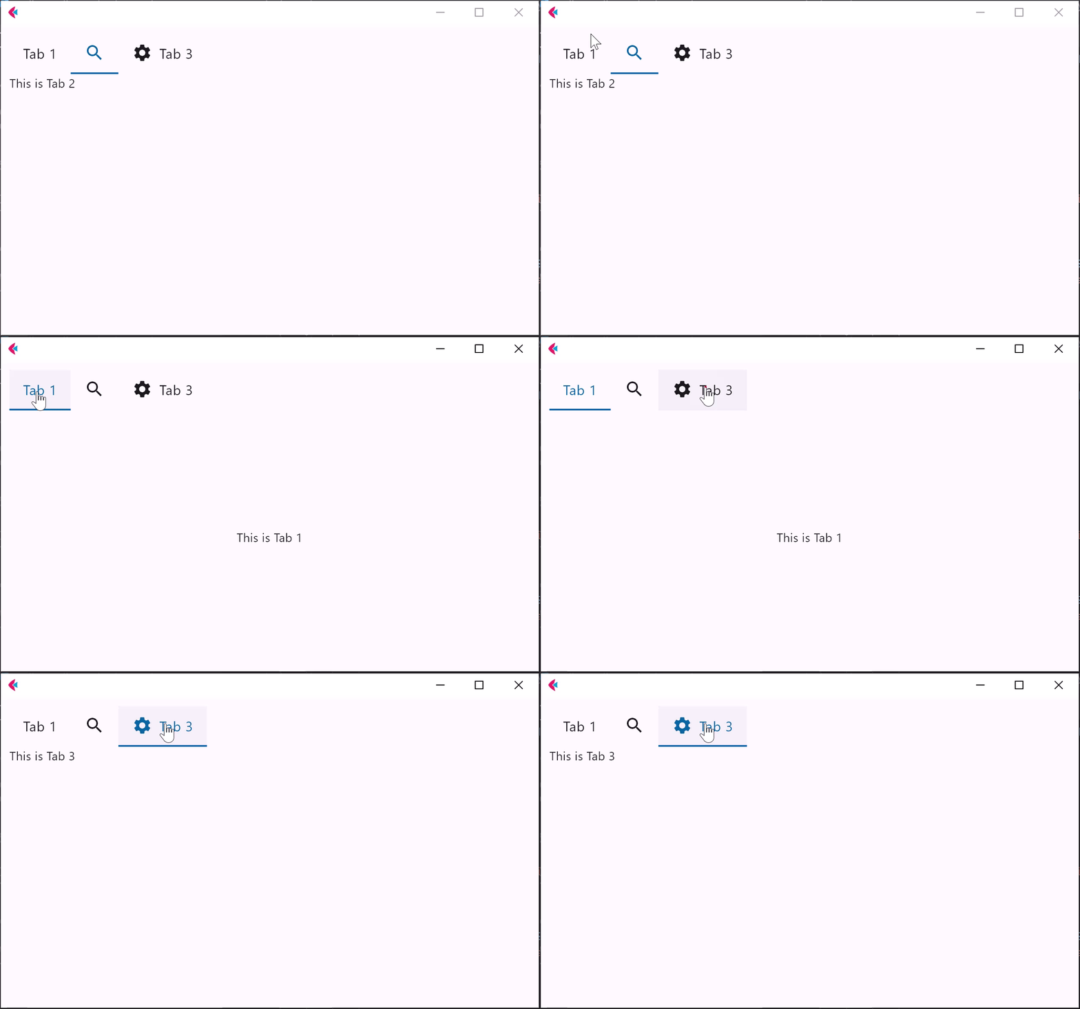
The Tabs control is used for navigating frequently accessed, distinct content categories. Tabs allow for navigation between two or more content views and relies on text headers to articulate the different sections of content.
Examples
Tabs
loading...
Tabs properties
animation_duration
Duration of animation in milliseconds of switching between tabs.
Defaults to 50.
clip_behavior
The content will be clipped (or not) according to this option.
Value is of type ClipBehavior.
divider_color
The color of the divider.
divider_height
The height of the divider.
Defaults to 1.0.
enable_feedback
Whether detected gestures should provide acoustic and/or haptic feedback. On Android, for example, setting this to True produce a click sound and a long-press will produce a short vibration.
Defaults to True.
indicator_border_radius
The radius of the indicator's corners.
indicator_border_side
The color and weight of the horizontal line drawn below the selected tab.
indicator_color
The color of the indicator(line that appears below the selected tab).
indicator_padding
Locates the selected tab's underline relative to the tab's boundary. The indicator_tab_size property can be used to define the tab indicator's bounds in terms of its (centered) tab widget with False, or the entire tab with True.
indicator_tab_size
True for indicator to take entire tab.
indicator_thickness
The thickness of the indicator. Value must be greater than zero.
Defaults to 3.0 when secondary=False, else 3.0.
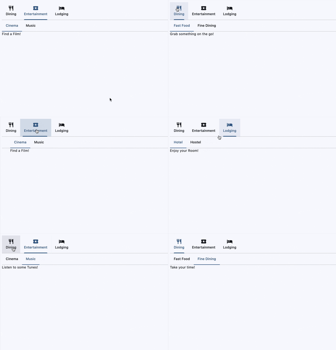
Nesting tabs
loading...
is_secondary
Whether to create a secondary/nested tab bar. Secondary tabs are used within a content area to further separate related content and establish hierarchy.
Defaults to False.
label_color
The color of selected tab labels.
label_padding
The padding around the tab label.
Value is of type Padding.
label_text_style
The text style of the tab labels.
Value is of type TextStyle.
mouse_cursor
The cursor to be displayed when a mouse pointer enters or is hovering over this control.
The value is MouseCursor enum.
overlay_color
Defines the ink response focus, hover, and splash colors in
various ControlState states.
The following ControlState values are supported: PRESSED, HOVERED and FOCUSED.
padding
The padding around the Tabs control.
Value is of type Padding.
selected_index
The index of currently selected tab.
scrollable
Whether this tab bar can be scrolled horizontally.
If scrollable is True, then each tab is as wide as needed for its label and the entire Tabs controls is scrollable. Otherwise each tab gets an equal share of the available space.
splash_border_radius
Defines the clipping radius of splashes that extend outside the bounds of the tab.
Value is of type BorderRadius.
tab_alignment
Specifies the horizontal alignment of the tabs within the Tabs control.
Value is of type TabAlignment and defaults to TabAlignment.START,
if scrollable=True, and to TabAlignment.FILL, if scrollable=False.
tabs
A list of Tab controls.
unselected_label_color
The color of unselected tab labels.
unselected_label_text_style
The text style of the unselected tab labels.
Value is of type TextStyle.
Tabs events
on_change
Fires when selected_index changes.
on_click
Fires when a tab is clicked.
Tab properties
content
A Control to display below the Tab when it is selected.
icon
An icon to display on the left of Tab text.
tab_content
A Control representing custom tab content replacing text and icon.
text
Tab's display name.