ResponsiveRow
ResponsiveRow borrows the idea of grid layout from Bootstrap web framework.
ResponsiveRow allows aligning child controls to virtual columns. By default, a virtual grid has 12 columns, but that can be customized with ResponsiveRow.columns property.
Similar to expand property, every control now has col property which allows specifying how many columns a control should span. For example, to make a layout consisting of two columns spanning 6 virtual columns each:
import flet as ft

ft.ResponsiveRow([
    ft.Column(col=6, controls=[ft.Text("Column 1")]),
    ft.Column(col=6, controls=[ft.Text("Column 2")])
])
ResponsiveRow is "responsive" because it can adapt the size of its children to a changing screen (page, window) size. col property in the example above is a constant number which means the child will span 6 columns for any screen size.
If ResponsiveRow's child doesn't have col property specified it spans the maximum number of columns.
col can be configured to have a different value for specific "breakpoints". Breakpoints are named dimension ranges:
| Breakpoint | Dimension |
|---|---|
| xs | <576px |
| sm | ≥576px |
| md | ≥768px |
| lg | ≥992px |
| xl | ≥1200px |
| xxl | ≥1400px |
For example, the following example collapses content into a single column on a mobile device and takes two columns on larger screens:
import flet as ft

ft.ResponsiveRow([
    ft.Column(col={"sm": 6}, controls=[ft.Text("Column 1")]),
    ft.Column(col={"sm": 6}, controls=[ft.Text("Column 2")])
])
Examples
ResponsiveRow
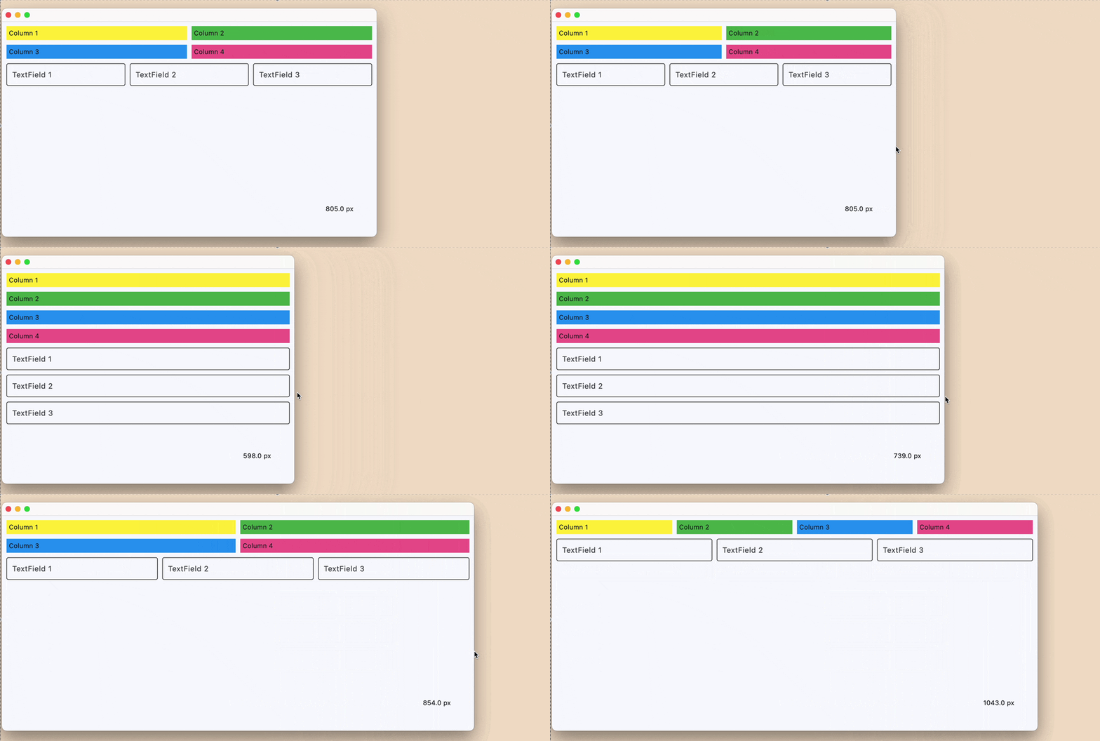
loading...
Properties
alignment
How the child Controls should be placed horizontally.
Value is of type MainAxisAlignment and defaults
to MainAxisAlignment.START.
columns
The number of virtual columns to layout children.
Defaults to 12.
controls
A list of Controls to display inside the ResponsiveRow.
rtl
True to set text direction to right-to-left.
Defaults to False.
run_spacing
Spacing between runs when row content is wrapped on multiple lines.
Defaults to 10.
spacing
Spacing between controls in a row in virtual pixels. It is applied only when alignment is set
to MainAxisAlignment.START, MainAxisAlignment.END or MainAxisAlignment.CENTER.
Defaults to 10.
vertical_alignment
How the child Controls should be placed vertically.
Value is of type CrossAxisAlignment and defaults
to CrossAxisAlignment.START.