ExpansionPanelList
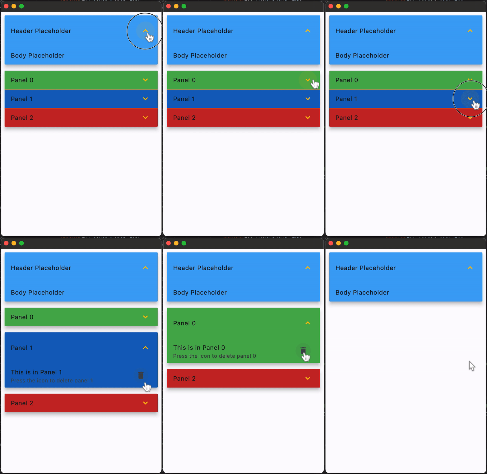
A material expansion panel list that lays out its children and animates expansions.
Examples
Simple Example
loading...
ExpansionPanelList Properties
controls
A list of ExpansionPanels to display inside ExpansionPanelList.
divider_color
The color of the divider when ExpansionPanel.expanded is False.
elevation
Defines the elevation of the children controls (ExpansionPanels), while it is expanded. Default value is 2.
expanded_header_padding
Defines the padding around the header when expanded.
Padding value is an instance of Padding class. Default value
is padding.symmetric(vertical=16.0).
expanded_icon_color
The color of the icon. Defaults to colors.BLACK_54 in light theme mode and colors.WHITE_60 in dark theme mode.
spacing
The size of the gap between the ExpansionPanels when expanded.
Events
on_change
Fires when an ExpansionPanel is expanded or collapsed. The event's data (e.data), contains the index of the ExpansionPanel which triggered this event.
ExpansionPanel properties
bgcolor
The background color of the panel.
content
The control to be found in the body of the ExpansionPanel. It is displayed below the header when the panel is expanded.
If this property is None, the ExpansionPanel will have a placeholder Text as content.
can_tap_header
If True, tapping on the panel's header will expand or collapse it. Defaults to False.
expanded
Whether expanded(True) or collapsed(False). Defaults to False.
header
The control to be found in the header of the ExpansionPanel. If can_tap_header is True, tapping on the header will expand or collapse the panel.
If this property is None, the ExpansionPanel will have a placeholder Text as header.