NavigationDrawer
Material Design Navigation Drawer component.
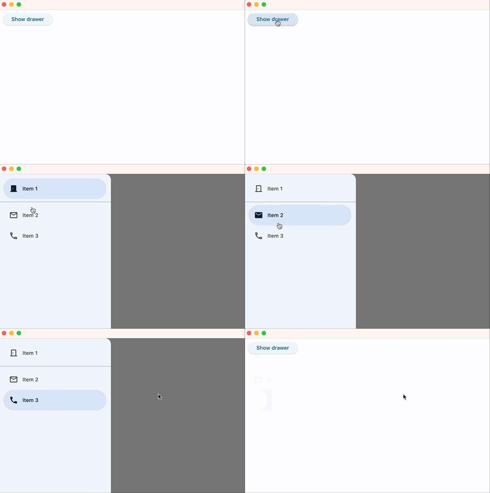
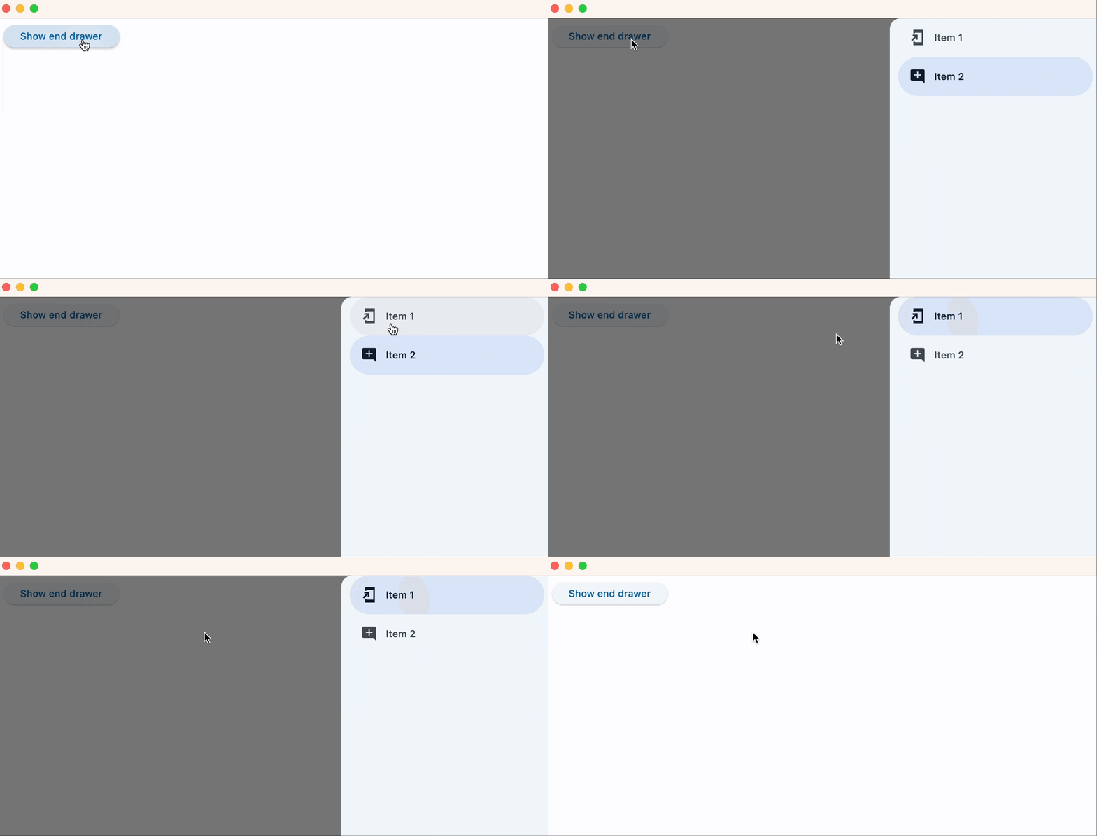
Navigation Drawer is a panel that slides in horizontally from the left or right edge of a page to show primary destinations in an app. To add NavigationDrawer to the page, use page.drawer and page.end_drawer properties. Similarly, the NavigationDrawer can be added to a View. To display the drawer, set its open property to True.
To open this control, simply call the page.open() helper-method.
Examples
NavigationDrawer sliding from the left edge of a page
loading...
NavigationDrawer sliding from the right edge of a page
loading...
NavigationDrawer properties
bgcolor
The color of the navigation drawer itself.
controls
Defines the appearance of the items within the navigation drawer.
The list contains NavigationDrawerDestination items and/or other controls such as headlines and dividers.
elevation
The elevation of the navigation drawer itself.
indicator_color
The color of the selected destination indicator.
indicator_shape
The shape of the selected destination indicator.
Value is of type OutlinedBorder.
position
The position of this drawer.
Value is of type NavigationDrawerPosition and defaults
to NavigationDrawerPosition.START.
selected_index
The index for the current selected NavigationDrawerDestination or null if no destination is selected.
A valid selected_index is an integer between 0 and number of destinations - 1. For an invalid selected_index, for
example, -1, all destinations will appear unselected.
shadow_color
The color used for the drop shadow to indicate elevation.
surface_tint_color
The surface tint of the Material that holds the NavigationDrawer's contents.
tile_padding
Defines the padding for NavigationDrawerDestination controls.
NavigationDrawer events
on_change
Fires when selected destination changed.
on_dismiss
Fires when drawer is dismissed by clicking outside of the panel or programmatically.
NavigationDrawerDestination properties
bgcolor
The color of this destination.
icon
The name of the icon or Control of the destination.
Example with icon name:
icon=ft.Icons.BOOKMARK
Example with Control:
icon=ft.Icon(ft.Icons.BOOKMARK)
If selected_icon is provided, this will only be displayed when the destination is not selected.
icon_content
icon_contentThe icon Control of the destination. Typically the icon is an Icon control. Used instead of icon property.
Deprecated in v0.25.0 and will be removed in v0.28.0. Use icon
instead.
label
The text label that appears below the icon of this NavigationDrawerDestination.
selected_icon
The name of alternative icon or Control displayed when this destination is selected.
Example with icon name:
selected_icon=ft.Icons.BOOKMARK
Example with Control:
selected_icon=ft.Icon(ft.Icons.BOOKMARK)
If this icon is not provided, the NavigationDrawer will display icon in either state.
selected_icon_content
selected_icon_contentAn alternative icon Control displayed when this destination is selected.
Deprecated in v0.25.0 and will be removed in v0.28.0. Use selected_icon
instead.