BottomAppBar
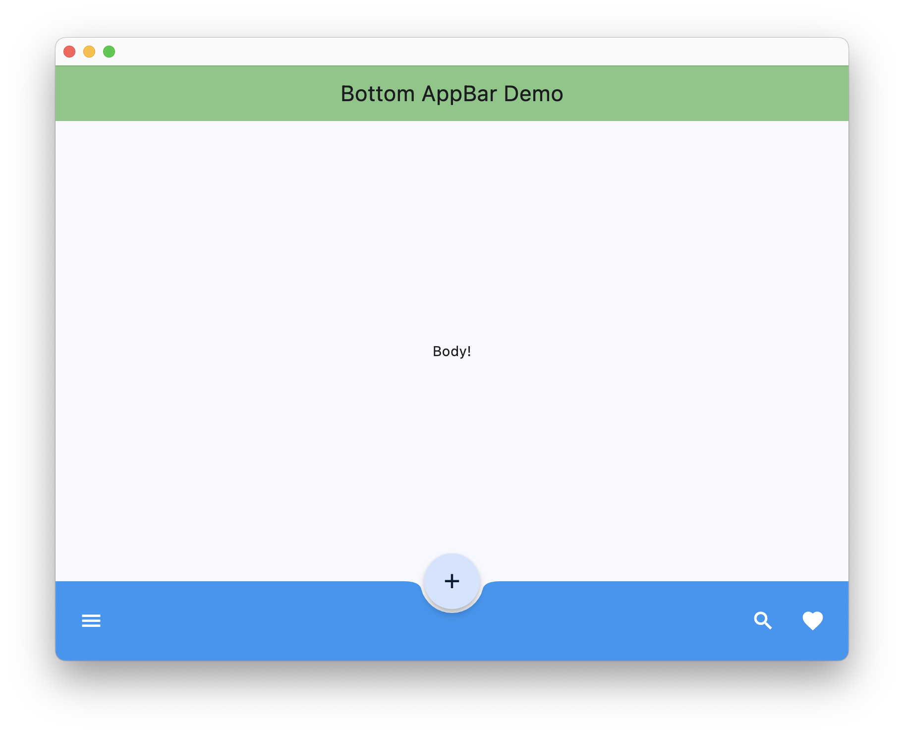
A material design bottom app bar.
Examples
BottomAppBar
loading...
Properties
bgcolor
The fill color to use for the BottomAppBar. Default color is defined by current theme.
clip_behavior
The content will be clipped (or not) according to this option.
Value is of type ClipBehavior and defaults to ClipBehavior.NONE.
content
A child Control contained by the BottomAppBar.
elevation
This property controls the size of the shadow below the BottomAppBar.
Defaults to 4.
height
The height of the BottomAppBar.
Defaults to 80.0 in material 3.
notch_margin
The margin between the FloatingActionButton and the BottomAppBar's notch.
Can be visible only if shape=None.
padding
Empty space to inscribe inside a container decoration (background, border). Padding is an instance
of Padding class.
Defaults to padding.symmetric(vertical=12.0, horizontal=16.0).
shadow_color
The color of the shadow below the BottomAppBar.
shape
The notch that is made for the floating action button.
Value is of type NotchShape.
surface_tint_color
The color used as an overlay on bgcolor to indicate elevation.
If this is None, no overlay will be applied. Otherwise this color will be composited on top of bgcolor with an opacity related to elevation and used to paint the BottomAppBar's background.
Defaults to None.