MenuItemButton
A button for use in a MenuBar or on its own, that can be activated by click or keyboard navigation.
Examples
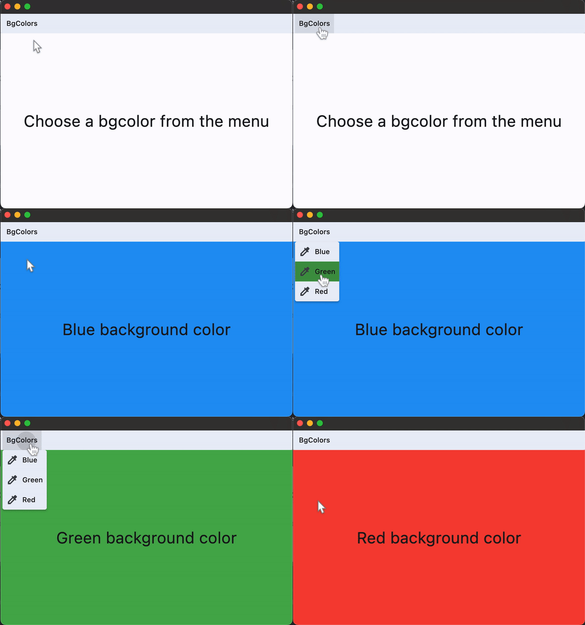
Basic Example
loading...
Properties
autofocus
Whether this button should automatically request focus.
Defaults to False.
clip_behavior
Whether to clip the content of this control or not.
Value is of type ClipBehavior and defaults to ClipBehavior.NONE.
close_on_click
Defines if the menu will be closed when the MenuItemButton is clicked.
Defaults to True.
content
The child control to be displayed in the center of this button.
Typically this is the button's label, using a Text control.
focus_on_hover
Determine if hovering can request focus.
Defaults to True.
leading
An optional control to display before the content.
Typically an Icon control.
overflow_axis
The direction in which the menu item expands.
If the menu item button is a descendent of MenuBar, then this property is ignored.
Value is of type Axis.
semantic_label
A string that describes the button's action to assistive technologies.
style
Customizes this button's appearance.
Value is of type ButtonStyle.
trailing
An optional control to display after the content.
Typically an Icon control.
Events
on_blur
Fired when this button loses focus.
on_click
Fired when the button is clicked.
on_focus
Fired when the button receives focus.
on_hover
Fired when the button is hovered.