ButtonStyle
Allows controlling all visual aspects of a button, such as shape, foreground, background and shadow colors, content padding, border width and radius.
Most of these style attributes could be configured for all or
particular ControlState of a button, such as HOVERED, FOCUSED, DISABLED
and others.
ButtonStyle class has the following properties:
alignment
The alignment of the button's content.
Value is of type Alignment.
animation_duration
Defines the duration in milliseconds of animated changes for shape and elevation.
bgcolor
The button's background fill color.
color
The color for the button's Text and Icon control descendants.
elevation
The elevation of the button's Material.
enable_feedback
Whether detected gestures should provide acoustic and/or haptic feedback.
Value is of type bool.
icon_color
The icon's color inside the button. If not set or None, then the color will be used.
icon_size
The icon's size inside of the button.
mouse_cursor
The cursor to be displayed when the mouse pointer enters or is hovering over the button.
overlay_color
The highlight color that's typically used to indicate that the button is focused, hovered, or pressed.
shadow_color
The shadow color of the button's Material.
surface_tint_color
The surface tint color of the button's Material.
padding
The padding between the button's boundary and its content.
Value is of type Padding.
shape
The shape of the button's underlying Material.
Value is of type OutlinedBorder.
side
An instance of BorderSide class, the color and weight of the button's outline.
text_style
The text style of the button's Text control descendants.
Value is of type TextStyle.
visual_density
Defines how compact the button's layout will be.
Value is of type VisualDensity.
Usage example
You can configure a different shape, background color for a hovered state and configure fallback values for all other states.
To configure style attribute for all Material states set its value to a literal (or class instance). For example, if you set color property to a literal the value will be applied to all button states:
ButtonStyle(
    color=ft.Colors.WHITE
)
To configure style attribute for specific Material states set its value to a dictionary where the key is state name. For example, to configure different background colors for HOVERED and FOCUSED states and another colors for all other states:
ButtonStyle(
    color={
        ft.ControlState.HOVERED: ft.Colors.WHITE,
        ft.ControlState.FOCUSED: ft.Colors.BLUE,
        ft.ControlState.DEFAULT: ft.Colors.BLACK,
    }
)
Various button shapes example
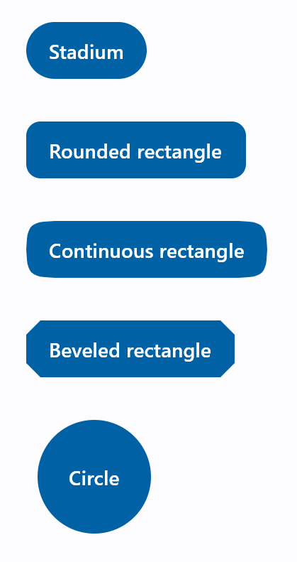
import flet as ft

def main(page: ft.Page):
    page.padding = 30
    page.spacing = 30
    page.add(
        ft.FilledButton(
            "Stadium",
            style=ft.ButtonStyle(
                shape=ft.StadiumBorder(),
            ),
        ),
        ft.FilledButton(
            "Rounded rectangle",
            style=ft.ButtonStyle(
                shape=ft.RoundedRectangleBorder(radius=10),
            ),
        ),
        ft.FilledButton(
            "Continuous rectangle",
            style=ft.ButtonStyle(
                shape=ft.ContinuousRectangleBorder(radius=30),
            ),
        ),
        ft.FilledButton(
            "Beveled rectangle",
            style=ft.ButtonStyle(
                shape=ft.BeveledRectangleBorder(radius=10),
            ),
        ),
        ft.FilledButton(
            "Circle",
            style=ft.ButtonStyle(shape=ft.CircleBorder(), padding=30),
        ),
    )

ft.app(main)
Styled button example
Check the following example:
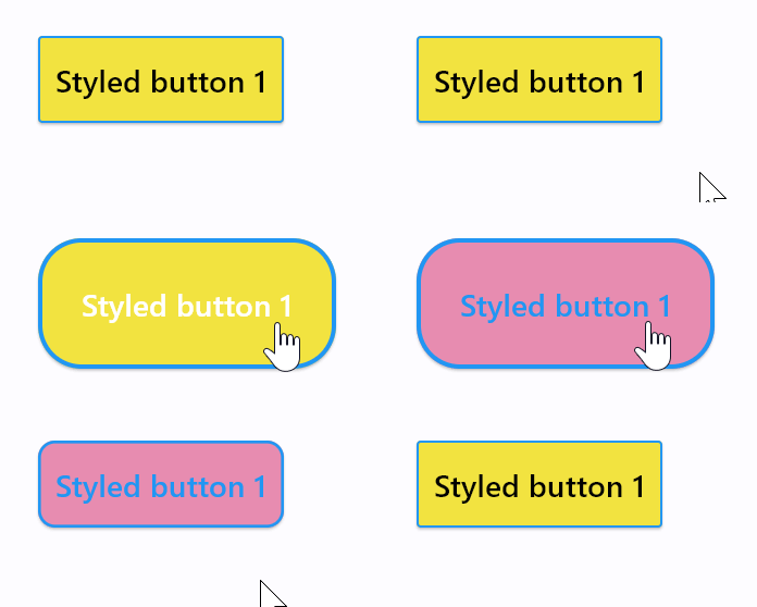
import flet as ft

def main(page: ft.Page):

    page.add(
        ft.ElevatedButton(
            "Styled button 1",
            style=ft.ButtonStyle(
                color={
                    ft.ControlState.HOVERED: ft.Colors.WHITE,
                    ft.ControlState.FOCUSED: ft.Colors.BLUE,
                    ft.ControlState.DEFAULT: ft.Colors.BLACK,
                },
                bgcolor={ft.ControlState.FOCUSED: ft.Colors.PINK_200, "": ft.Colors.YELLOW},
                padding={ft.ControlState.HOVERED: 20},
                overlay_color=ft.Colors.TRANSPARENT,
                elevation={"pressed": 0, "": 1},
                animation_duration=500,
                side={
                    ft.ControlState.DEFAULT: ft.BorderSide(1, ft.Colors.BLUE),
                    ft.ControlState.HOVERED: ft.BorderSide(2, ft.Colors.BLUE),
                },
                shape={
                    ft.ControlState.HOVERED: ft.RoundedRectangleBorder(radius=20),
                    ft.ControlState.DEFAULT: ft.RoundedRectangleBorder(radius=2),
                },
            ),
        )
    )

ft.app(main)